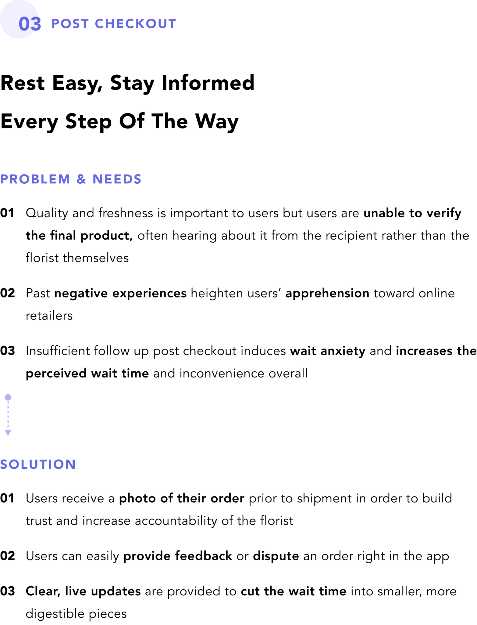
Bridging the Gap Between
In-Person & Online Floral Purchases
Project Type
Personal Project
My Contributions
Sole Product Designer
Timeline
6 weeks
Tools


Empowering Users Through Personalization — Bloom aims to bridge the gap between in-person and online floral purchases by enabling users to create their ideal floral arrangement through a streamlined customization feature. This case study explores how personalization and customization help users achieve their goals while minimizing the time and effort spent searching for the perfect arrangement. Additionally, it highlights the importance of verification — a widely neglected but crucial user need — in rebuilding trust in online retailers and improving users' perception of convenience when shopping for flowers.
DISCOVER
01. White Paper Research
While I was determined to take on the task on designing an app for a floral service, after conducting a bit of background research, I discovered that a vast majority of consumers prefer to use in-person outlets to purchase flowers over online ones. This was surprising to me considering that most industries are successfully transitioning more and more to a digital space. It sparked the question - why is there such a disconnect for the floral industry?


02. User Research
User surveys and interviews were conducted to gain insight into the factors that influence a floral purchase and identify where online retailers were falling short. I also took a deep dive at the competition to further empathize with the users and strategize how I might differentiate the product to better address user goals, needs, and pain points.
Research Method
Research Questions
Where or how do you prefer to purchase flowers and why?
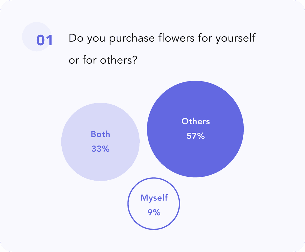
Do you purchase flowers for yourself or for others?
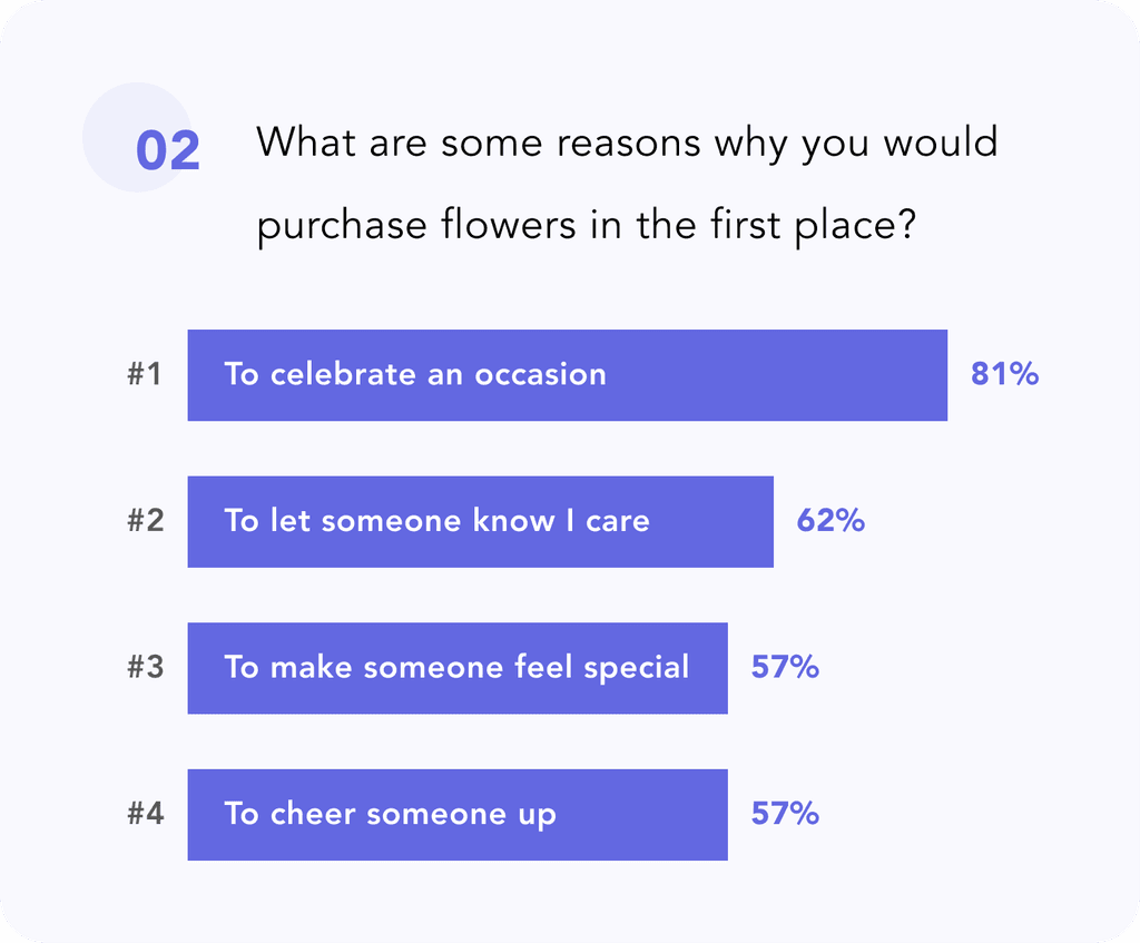
What are some reasons why you would purchase flowers in the first place?
What are some determining factors or traits you look for when picking out a floral arrangement?
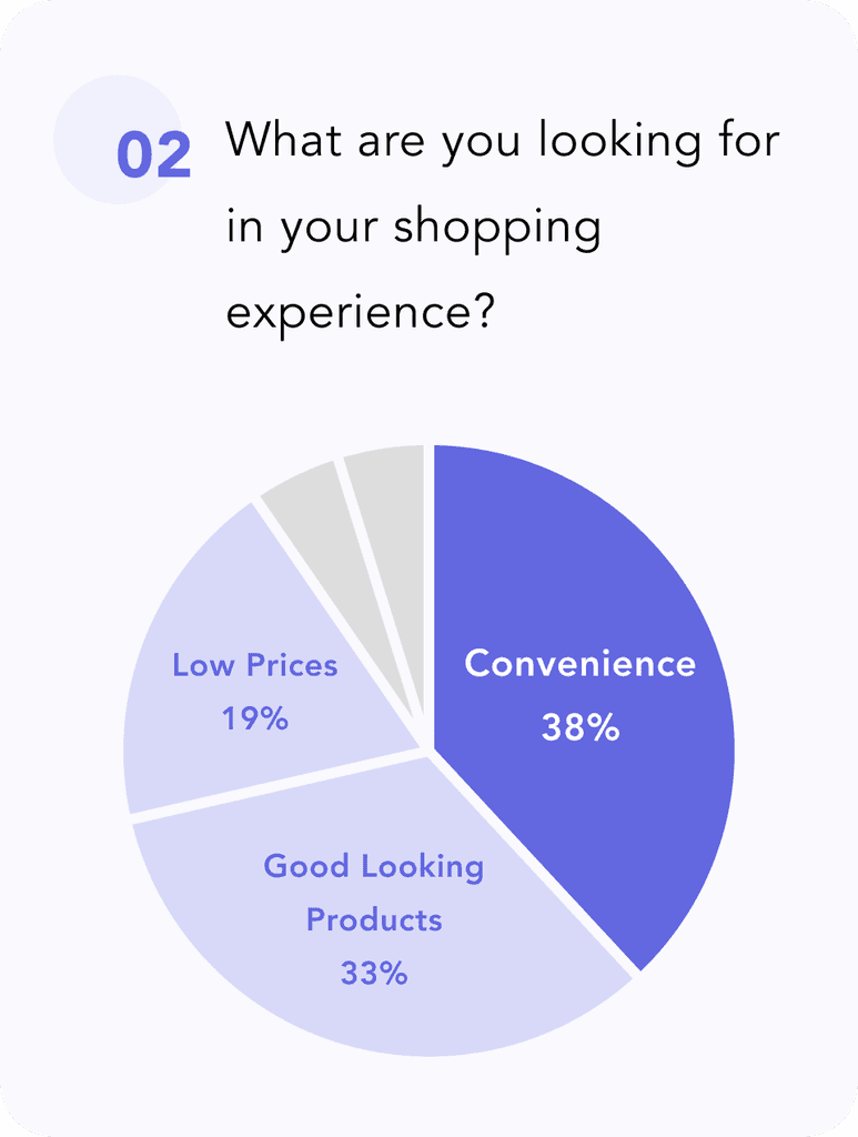
What are you looking for in your shopping experience when purchasing flowers?
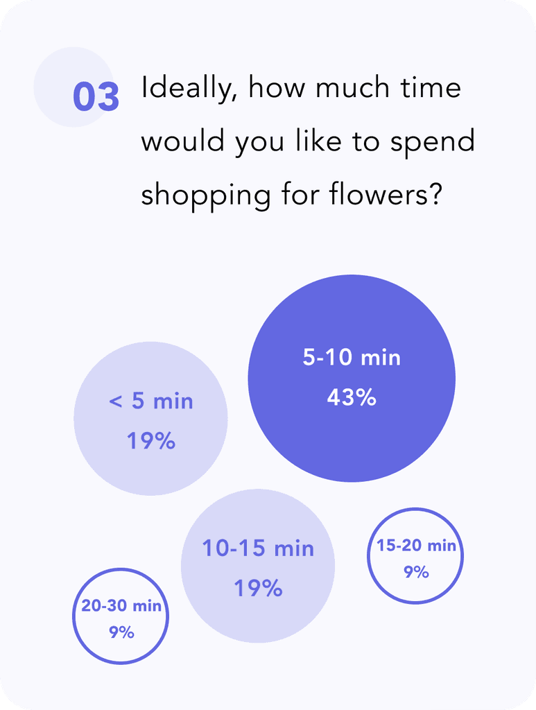
Ideally, how much time would you want to spend shopping for flowers?
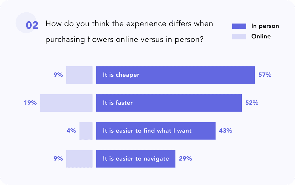
How do you think the experience differs when purchasing flowers online versus in person?
What challenges do you face when shopping for floral arrangements? What do you wish could be done differently?
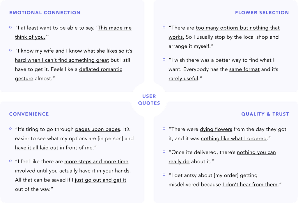
03. Research Findings
User Goals
User Needs

Pain Points

Themes & Standout Quotes
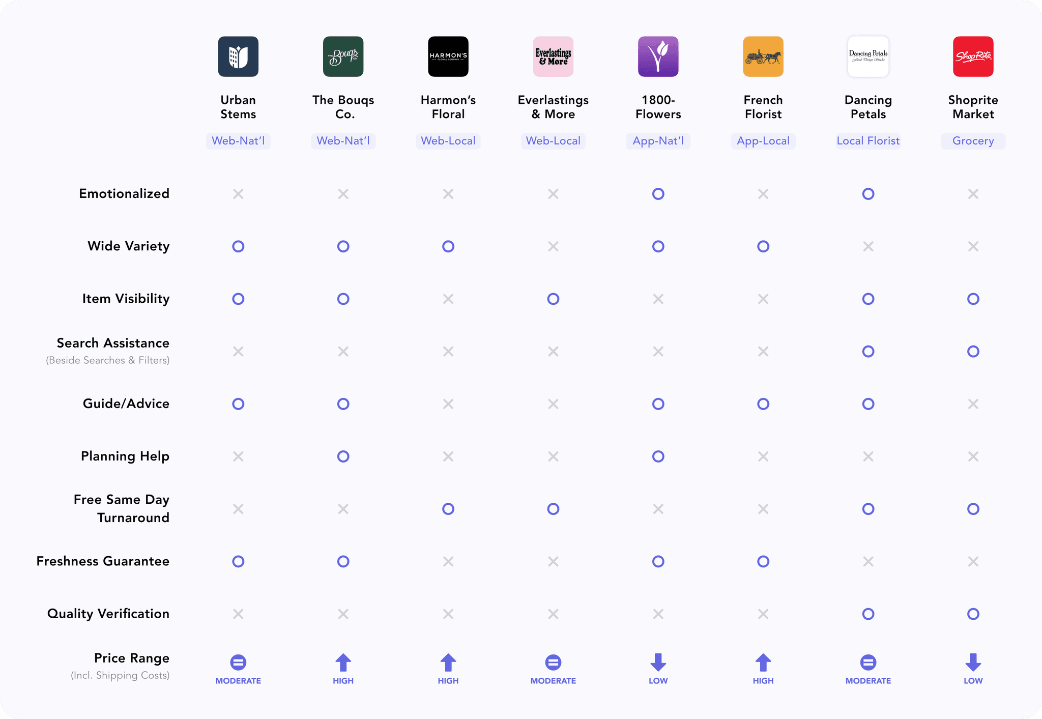
04. Competitive Analysis
Examining the competition definitely boosted my understanding of why users expressed frustrations with online retailers. Most platforms followed a cookie-cutter format, offering a non-targeted and general approach to navigating extensive product lists. I was also able to confirm that the user needs identified through the surveys and interviews were largely being unmet. Below, I assessed how well the retailers addressed each user need uncovered during research.
DEFINE
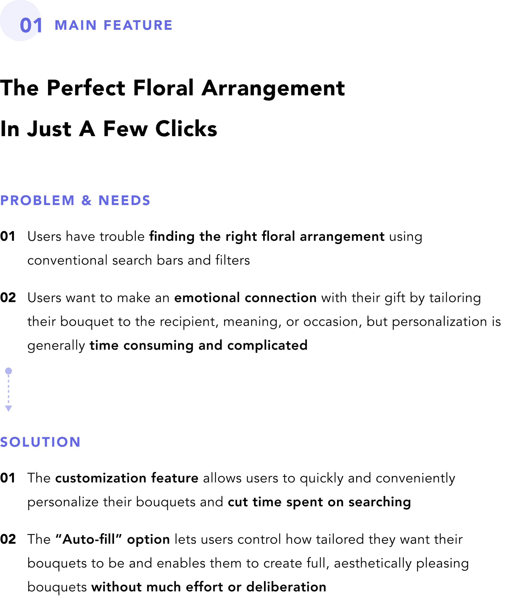
01. The Problem Space
After the research phase, I was able to gain a clearer picture of the challenges that users were facing and the problems that I would be solving for. I distilled these insights into four main categories, outlined below, to ultimately inform the problem statements.


02. User Personas
I categorized the users into two groups — gift users and self-users — and created personas for each to keep user needs front and center throughout the design process. While both groups had specific attributes and flowers in mind for their floral arrangement, they differed in their level of interest in aesthetics, knowledge of flowers, and price sensitivity.
User Personas

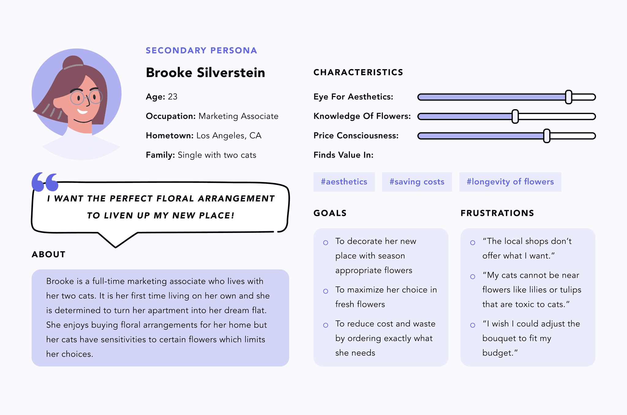
The product would aim to streamline the user journey for both the primary and secondary personas by addressing their unique needs and simplifying user tasks. For the primary persona, the focus was on providing a quick and convenient way to help find a tailored floral arrangement that would delight the recipient. Meanwhile, for the secondary persona, the key value was to offer a wide range of options that align with their higher sensitivity to aesthetics and flower preferences.
Develop
01. Ideation & Design
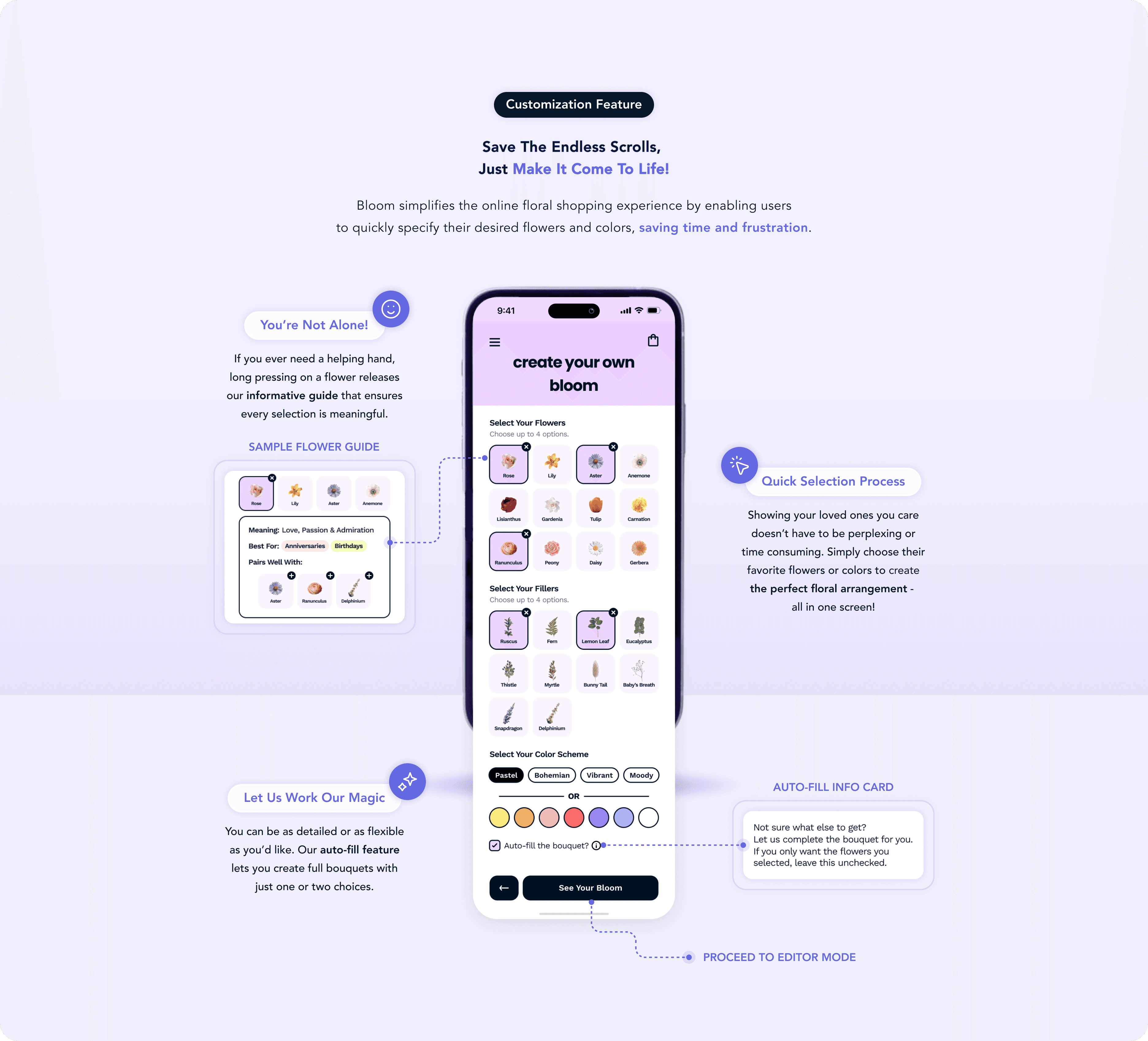
The ideation phase centered on addressing the most significant pain point: simplifying flower selection through a convenient and streamlined process. I felt customization was key, as it would break the arduous cycle users underwent to search for the perfect floral arrangement, while encompassing the needs of both the primary and secondary personas. This approach also aligned with users' ultimate goal of making an emotional connection. To refine this concept, I conducted the Crazy 8’s exercise and carefully evaluated the pros and cons of each design.
Crazy 8's Exercise

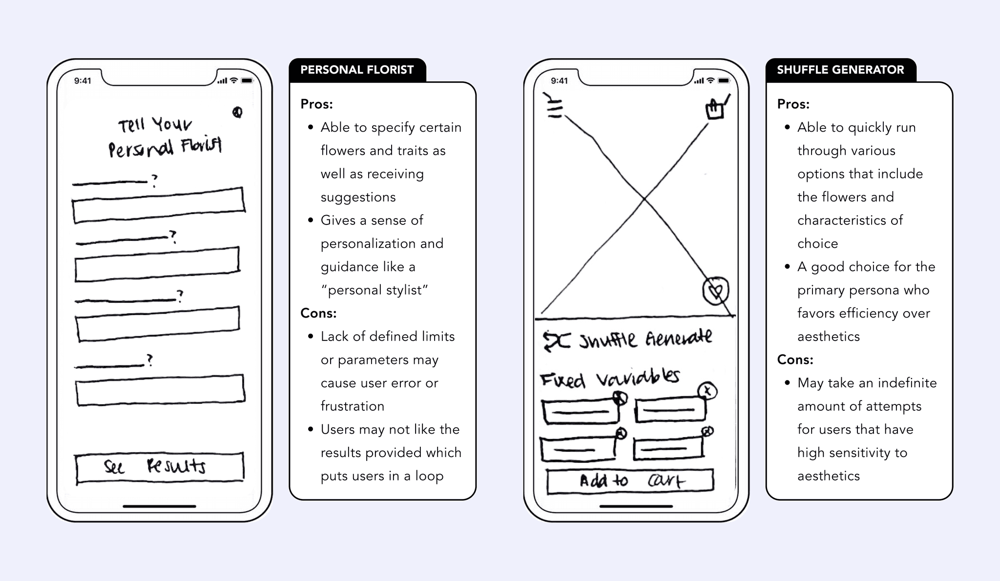
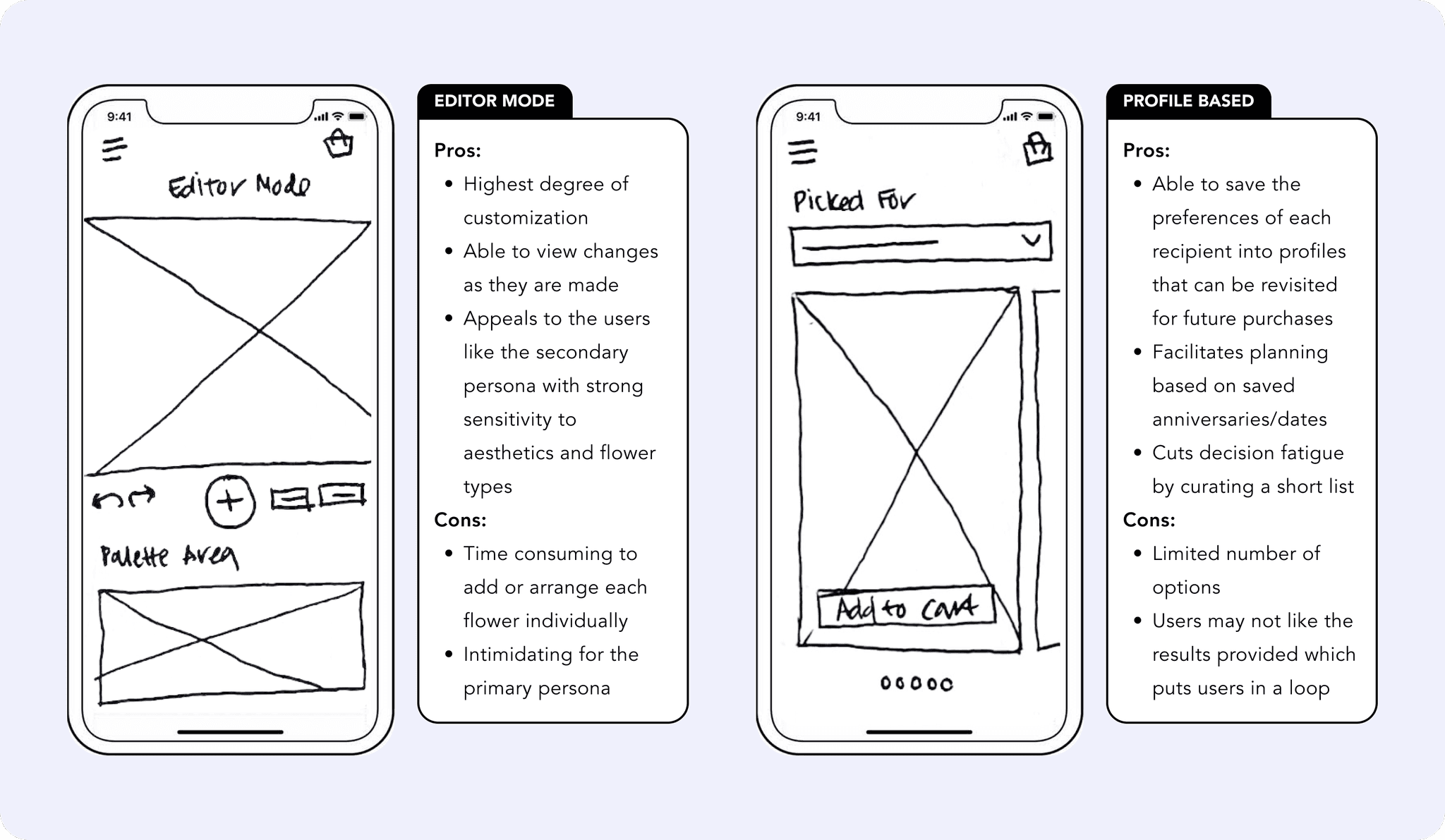
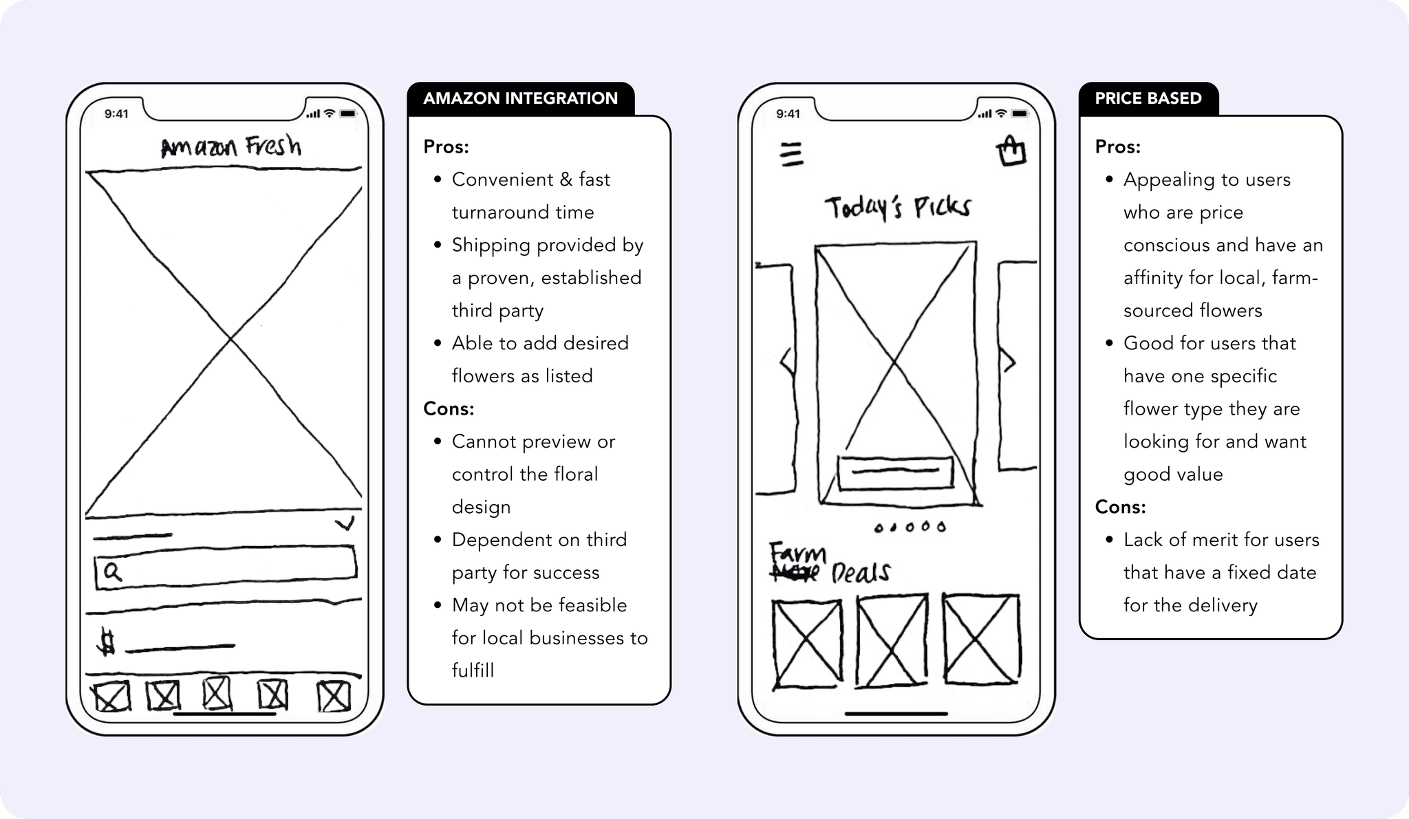
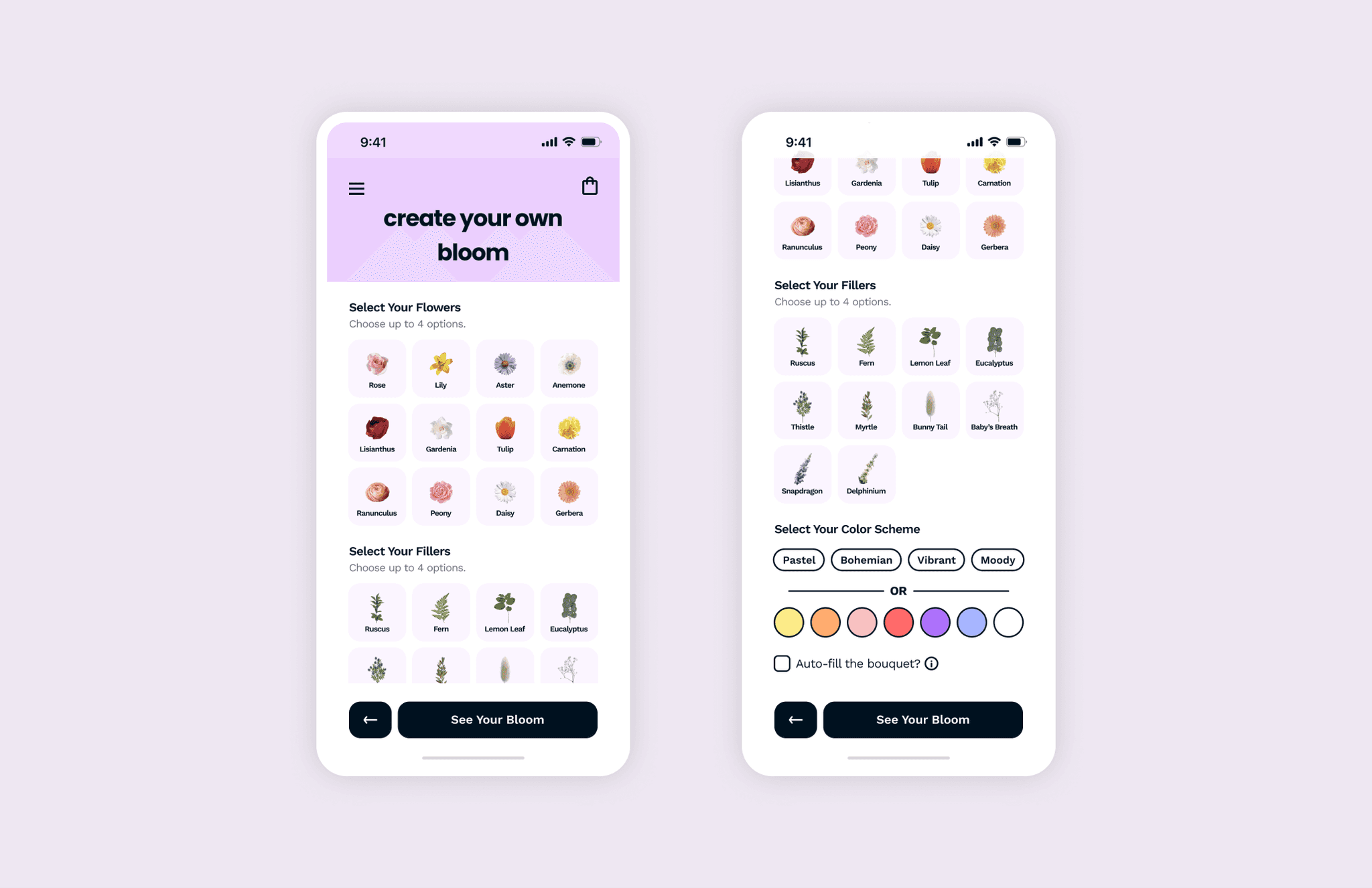
Upon thorough consideration of each potential solution, I decided to proceed with the ‘Create Your Own’ model since it would provide a wide capacity for customization in a quick and familiar process. I felt that familiarity was important to lower the barrier to entry and ensure a straight-forward and satisfying experience for a broad range of users. With the goals, users, and features in mind, I was now ready to bring the product to life.
User Flow Diagrams
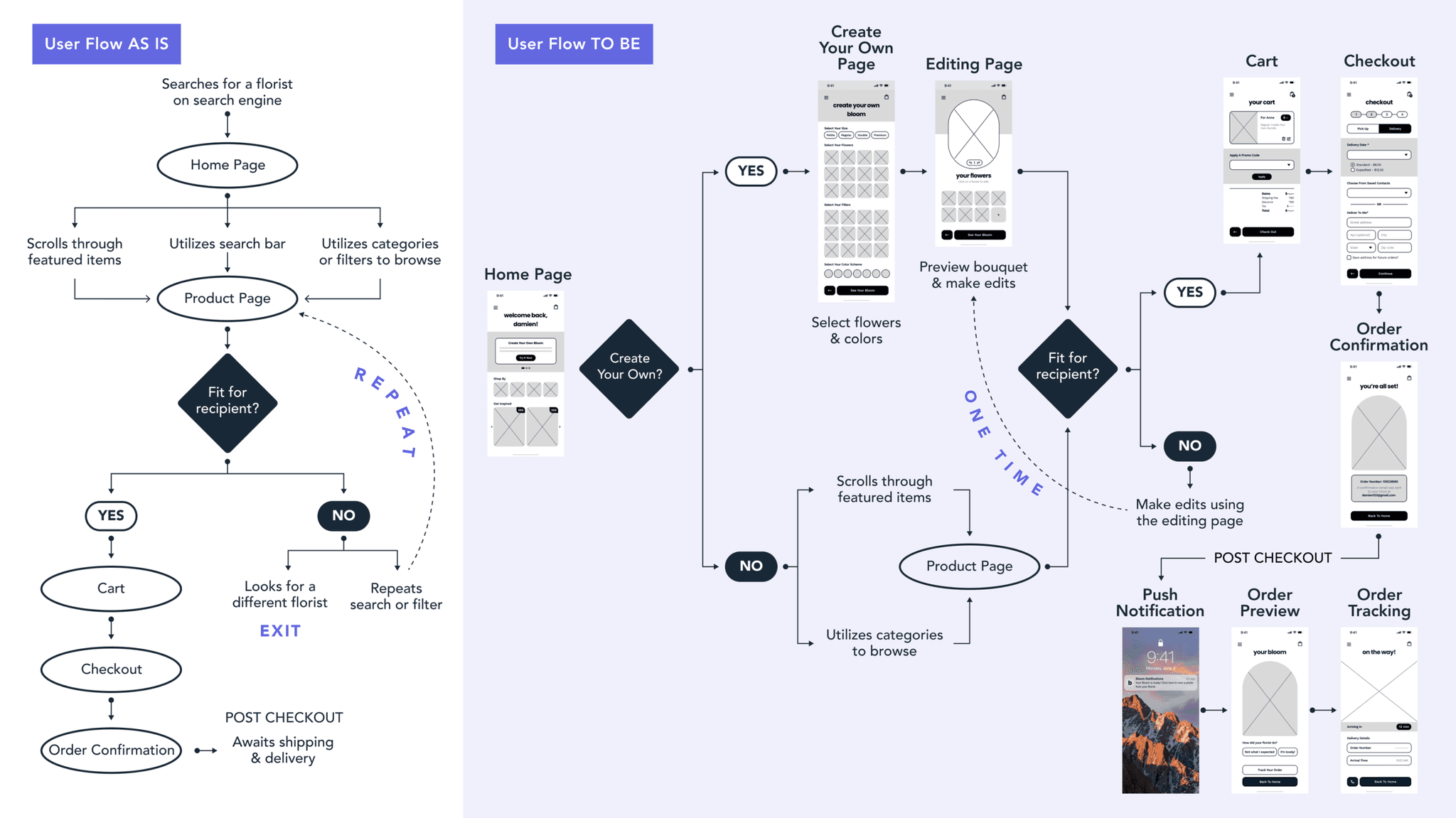
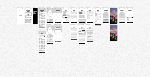
Wireframes to Mockups
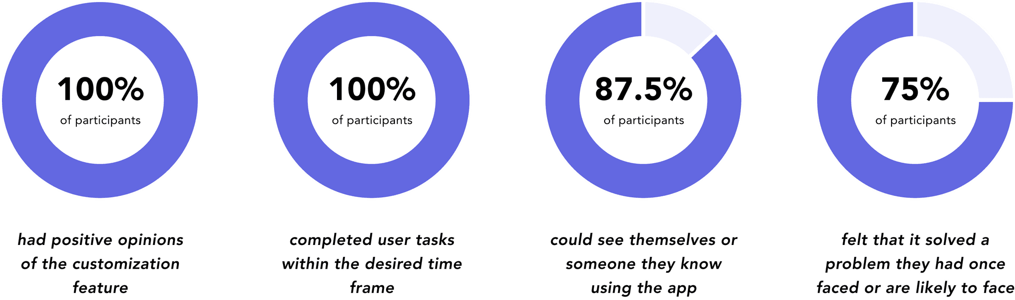
02. Usability Testing
Eight participants were recruited for the usability test including two participants from the user interviews. All participants were able to complete user tasks with ease within the desired time frame of 5-10 minutes. Participants also reacted very positively to the “Create Your Own” feature, noting that it felt fun, exciting, or novel.
03. Iterations
The usability tests also revealed some crucial adjustments that needed to be made in order to improve user navigation and engagement with the customization feature.
Notable iterations included —
Helping The Primary Persona
At the selection screen, all participants were able to select the first few flowers with ease. However when it came to completing their bouquets, some participants expressed doubts and uncertainty about their aesthetic judgment. Addressing this concern was crucial, as it highlighted a challenge that the primary persona could face.
To resolve this, two features were added —
01
Adding flower guides that would provide the meaning, suggested occasions, and pairings for a particular flower.
02
Adding an auto-fill option that would automatically assist users in completing the bouquet with complementing flowers.

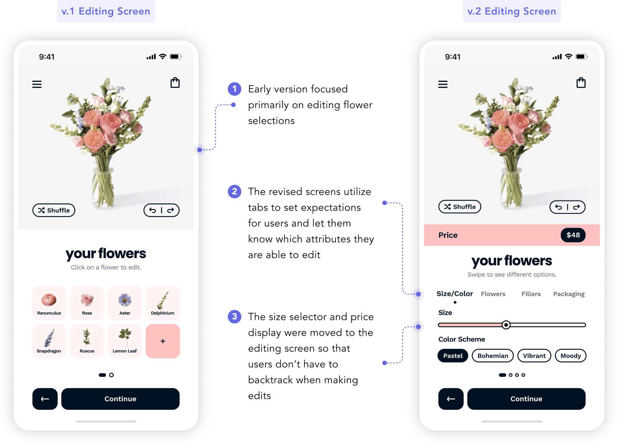
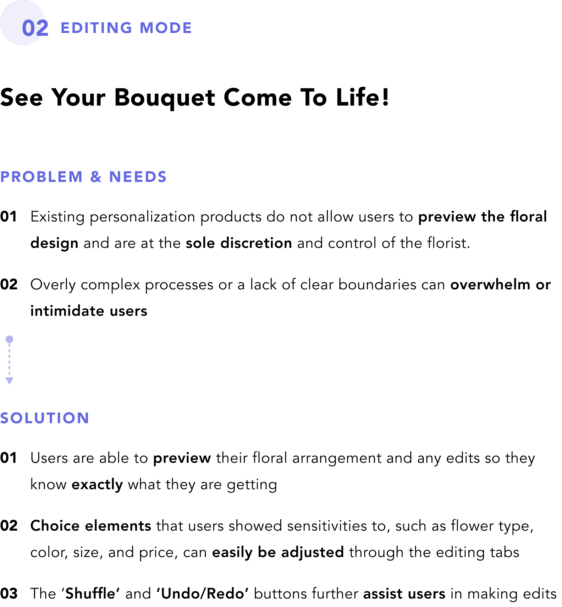
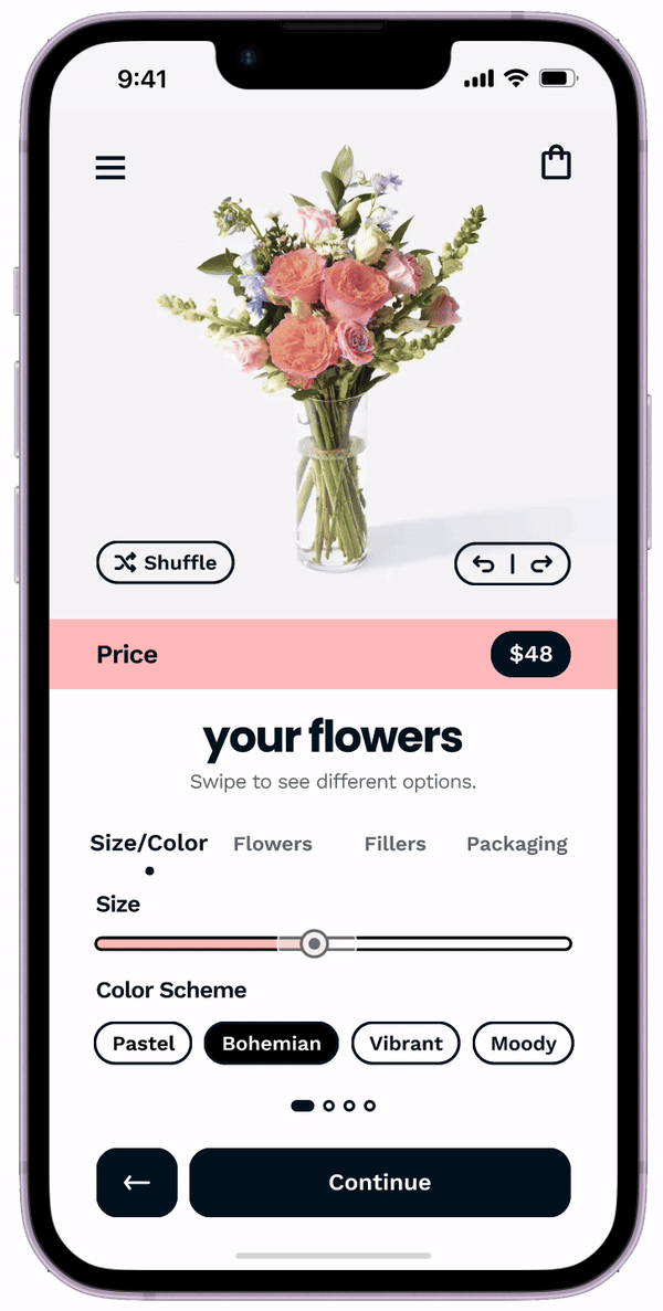
Reflecting Price & Size
Before usability tests, users were required to select the bouquet size and their respective price during the initial selection screen, as shown above. This setup forced users to return to the selection screen to make size adjustments and prevented them from seeing price updates when editing their bouquets. To address this issue, I moved the price display and size adjuster to the editing screen, enabling users to preview and edit their bouquets seamlessly without having to backtrack.
Deliver
01. Snapshot
02. Key Flows


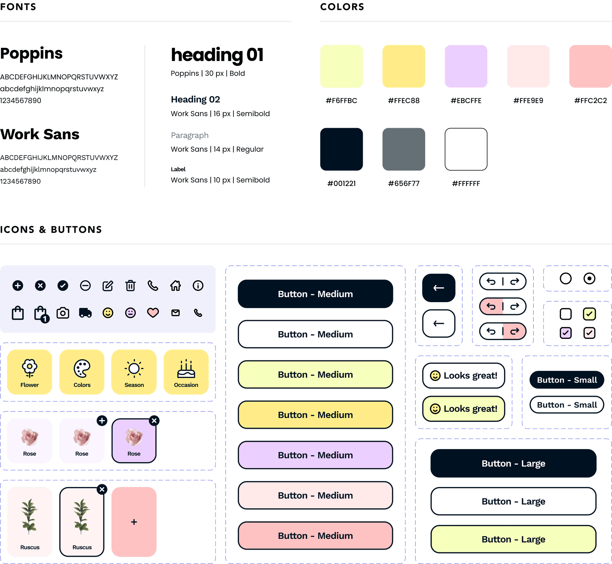
03. Style Guide
REFLECT
This project reinforced the critical role of user research in the design process. While I had somewhat anticipated users’ frustration with the process of searching for flowers online, I was surprised to find just how much value users placed on the freshness of floral products – especially considering how little existing services did to cater to this need. The research broadened my perspective going into the project, but the discovery of multiple user needs also posed the challenge of determining which pain points to prioritize and how to balance these insights into a focused and effective solution. In the end, it was also through listening to users’ voices that I was able to settle my self doubts and recalibrate my approach, ultimately leading to a product that I feel successfully meets users’ needs.
Upon rollout, monitoring the conversion rate would be essential to assess whether the product truly addresses the gaps in user needs and proves to be desirable and valuable to users. Additionally, tracking drop-off points will help to identify where users may feel misaligned, whether it be due to price, selection, complexity, or other factors.
NEXT STEPS
The next steps I would take to build upon this project are —
How might we encourage users to plan their orders ahead of time?
Considering that a large portion of floral purchases are made for special events and occasions, helping users plan or schedule orders ahead of time could be a latent user need that may decrease the percentage of users that revert back to last minute in-person purchases. Having pre-scheduled orders is also likely to help reduce the logistic strains on the business.
How might we increase the value of the delivery?
For a large number of users and use cases, delivery was not an essential part of the floral purchase. A certain user even mentioned that handing the flowers in person and getting the recipient's reaction was the best part. However, users expressed feeling somewhat forced to pay for delivery when shopping online due to the lack of options that online retailers provided. While it’s possible to address this through service design (like expanding shipping and pickup options), it would be beneficial to also consider how we might increase the value of the delivery for users that opt to or inevitably choose to have their orders delivered.