Balancing Simplicity & sophistication for diverse business needs
IN A NUTSHELL
I redesigned the dashboard for Figure Manage, a business management platform, to better accommodate its growing and diverse user base. By introducing a more digestible, user-friendly format and implementing tools to help users stay focused and aligned, this redesign aims to simplify performance reports and facilitate informed decision-making for both small and large businesses alike.
Client
Figure Manage
My Contributions
Sole Product Designer
Timeline
1 week
Tools


The Dilemma That Comes With Growth — Figure offers a diverse suite of integrated products for business owners, with their management web app, Figure Manage, at its forefront. Initially, their client base consisted of small, local establishments and mom-and-pop restaurants that required minimal bookkeeping. At this stage, Figure noticed that the majority of their users were not utilizing the various financial data they offered on their platform and hence shifted focus to other services that would be more relevant and of value to these businesses. However, with a recent influx of new, larger-scale clients, Figure was looking to restrategize and reevaluate how to better cater to its now diverse pool of users, including those that required more sophisticated performance reports.
CONTEXT
Founder Interview
Before diving into the project, I had a chance to meet with one of the co-founders of Figure to go over the product, the 'why's', and the trajectory that the company was aiming to move toward.
For this redesign, we identified these main goals to focus on —
We also identified these constraints to consider —
Because data limitations were a factor, we went over the key screens of competitors to pinpoint the types of analytics that his team had the capabilities for and also discussed the types of data and features that his clients had been requesting.
Largely, data on reviews, operation times, and marketing were to be omitted, and it was requested that we keep the central revenue graph with an added option to compare daily revenue with corresponding averages and labor costs.
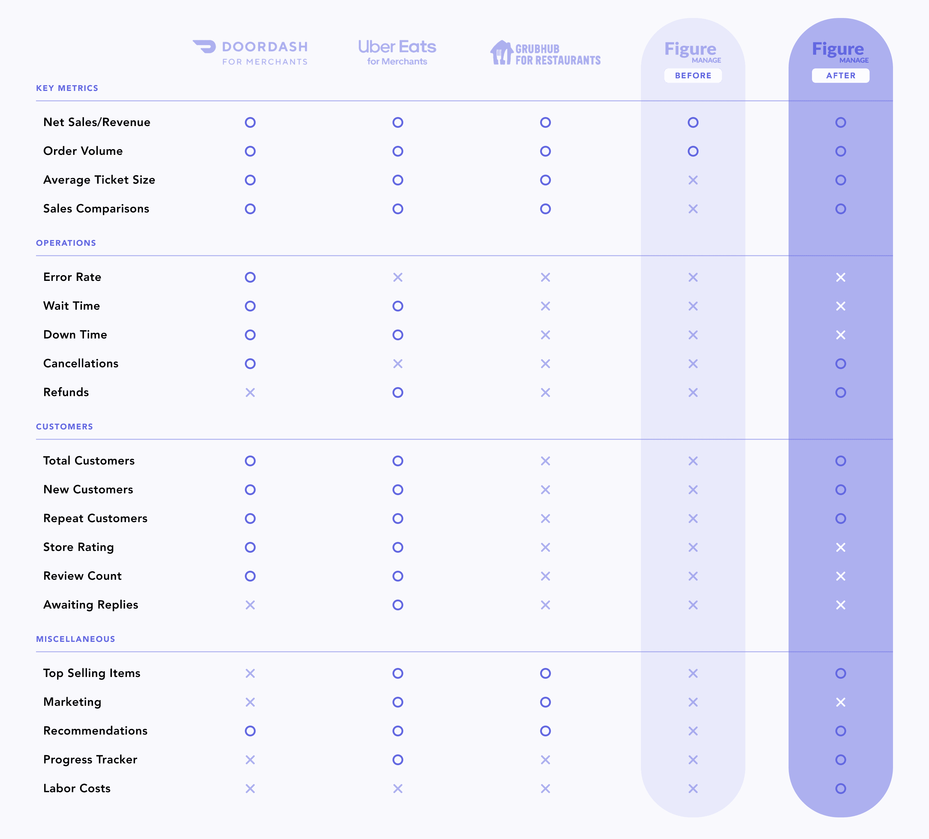
Below is a comparison of how Figure’s dashboard measured up against its competition before the redesign and how it was expected to compare after.
Figure vs. Competitors
EMPATHIZE
00. Status Quo
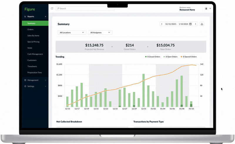
The Before
INITIAL DASHBOARD REVIEW
The screen above was the starting point from which I was to perform the redesign. To kick off the project, I conducted a quick critique of the dashboard and analyzed the pro’s and con’s of the product from a user’s perspective.
Pros
Provides detailed analytics on revenue compared to competitors
Integration with third party apps allow users to view compiled data in one place
Net revenue is prominently highlighted on the dashboard for a quick snapshot of business performance
Cons
Analytics were solely focused on revenue hindering a multifaceted view of performance
Low visibility and disorganization of the charts suggest high potential for users to disengage
Absence of guidance in comprehending graphs and metrics, leading to missed opportunities for optimization
01. User Research
Given time constraints, there was no leeway for extensive research recruitment. However, I was given the opportunity to conduct brief interviews with two of Figure's existing users. I asked each user to give me the run-down on how they were utilizing the product in their day-to-day, any pain points they experienced, and how their experience with Figure compared to those with other products.
Here’s what I learned —
Research Insights
Insight #1
Users were using the product to view net revenue, rarely exploring other metrics
Users almost solely used the dashboard for the purpose of viewing net revenue. I could deduce two reasons as to why this was the case: first, net revenue was the only information that was visibly highlighted on the dashboard; second, users found net revenue to be the most, or perhaps the only relevant metric on the dashboard.
Insight #2
Users were searching for the high’s, the low’s, the anomalies, and the extremes
Because users were well acquainted with the baseline of their daily operations, they tended to focus their attention on outlier events — such as when they had a particularly low-performing day or when there was a return or cancellation. In fact, the only times that users delved into the finer details (beyond net revenue) were the times when a known issue or anomaly had occurred.
Insight #3
Users were unsure of what to do with the information they were given — not just with Figure, but across all management platforms
While management platforms effectively delivered metrics and data, users ultimately sought to understand how these platforms would contribute to their business growth. Although all competitive products offered recommendations and suggested next steps, users were still struggling to make the conversion from data to actionable business decisions.
02. Competitive Analysis
Because the research pool was limited, I also sought insight from competitors and analyzed their approach on the user needs and pain points uncovered during the user interviews. By comparing each product side by side, I aimed to understand which elements we could adopt and which we could enhance or introduce to better align with user expectations.
Here are some of the explorations that were made —
Competitive Analysis
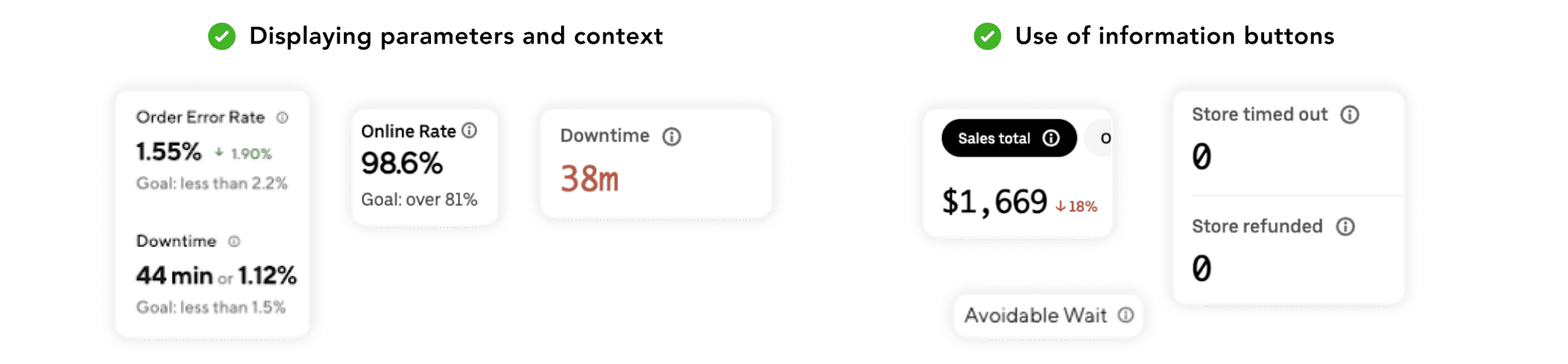
Informing Users of Context
Unlike Figure, I observed that competitors provided users with context – such as goals, comparisons, and visual cues – to help users assess whether a metric was good or bad. Competitors also guided users in the form of information buttons. Because users showed tendencies of shutting out metrics that they don't understand, it was imperative to educate users when necessary to make the product more relevant and inclusive, as well as to prevent drop-off.
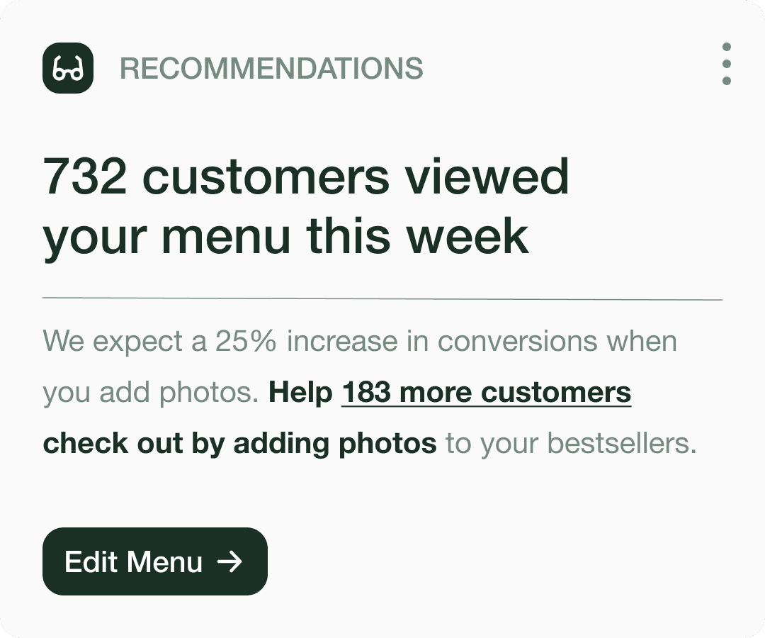
Recommendations
All competitors provided some form of recommendations or next steps, yet users still reported difficulty turning insights into action. I took a look at the kinds of suggestions that competitors were making in order to figure out why this was the case. I found that while the insights were fairly direct and straightforward, they failed to convey why users needed to take action or were too generic to be compelling, which ultimately led to dismissal.

Competitive Advantage
While competitors addressed the need for clear information and enhanced relevance by defining and providing context for metrics, they overlooked users' desire to identify and act on outlier events. I realized this gap presented an opportunity to differentiate Figure’s product in the redesign. By highlighting and tracking outliers, we could facilitate user tasks and help users recognize patterns to ultimately inform their business decisions.
DEFINE
After the research phase, I was able to gain a clearer picture of the challenges that users were facing and the problems that I would be solving for. I distilled these insights into four main categories, outlined below, to ultimately inform the problem statement.
The Problem Space


Problem Statement
IDEATE
To effectively tackle the challenges users were facing, I used "How Might We" (HMW) questions as a way to turn insights into opportunities for innovation. This approach allowed me to reframe specific user needs and break down pain points with a solution-oriented mindset.
How Might We's
How might we present information to users in a way that is clear and engaging?
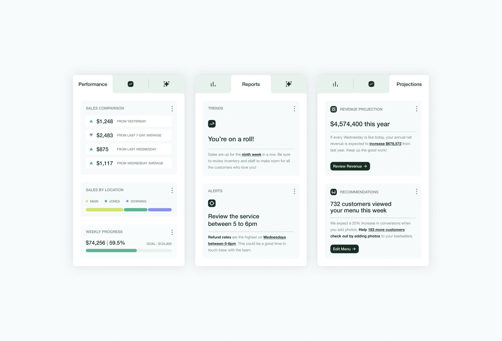
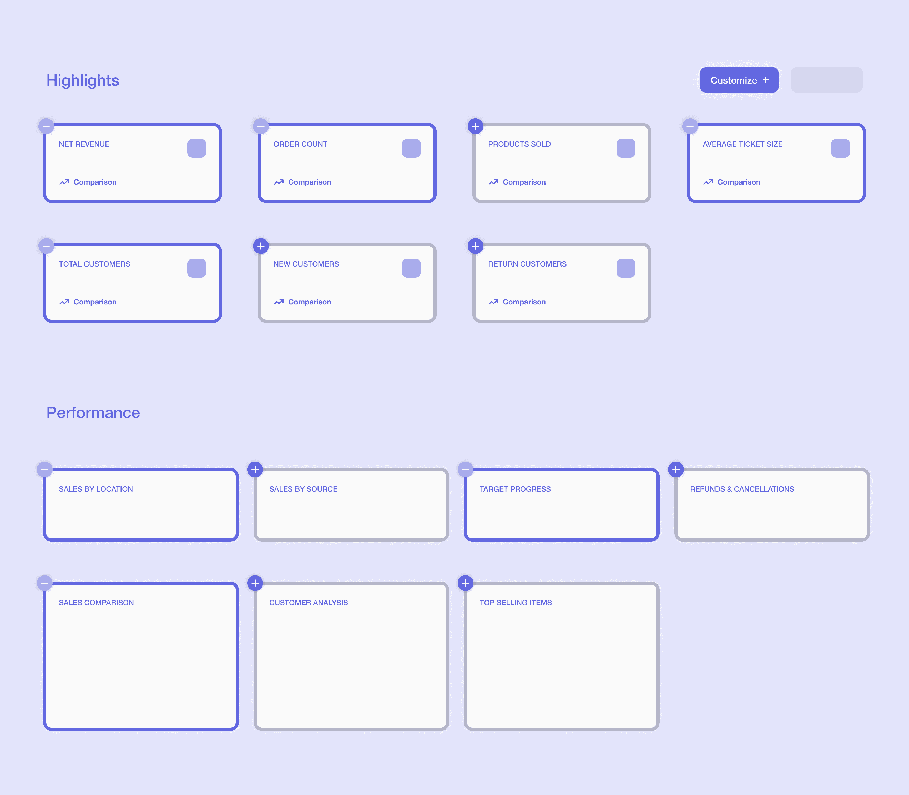
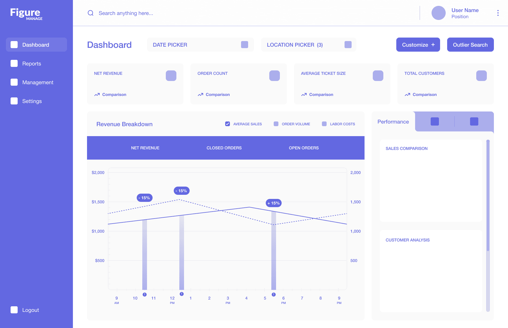
To address this, I started with a preliminary sketch that condensed data into concise, digestible widgets, making metrics easier to view and interpret at a glance. However, after reviewing the design, I realized that a long list of metrics could lead to mindless scrolling and disengagement, similar to the issues with the previous dashboard. To combat this, I revised the design, focusing on creating a one-page experience. In this approach, I utilized tabs to group data into manageable sections and help users maintain focus by requiring interaction to access specific information.
v1 Wireframe
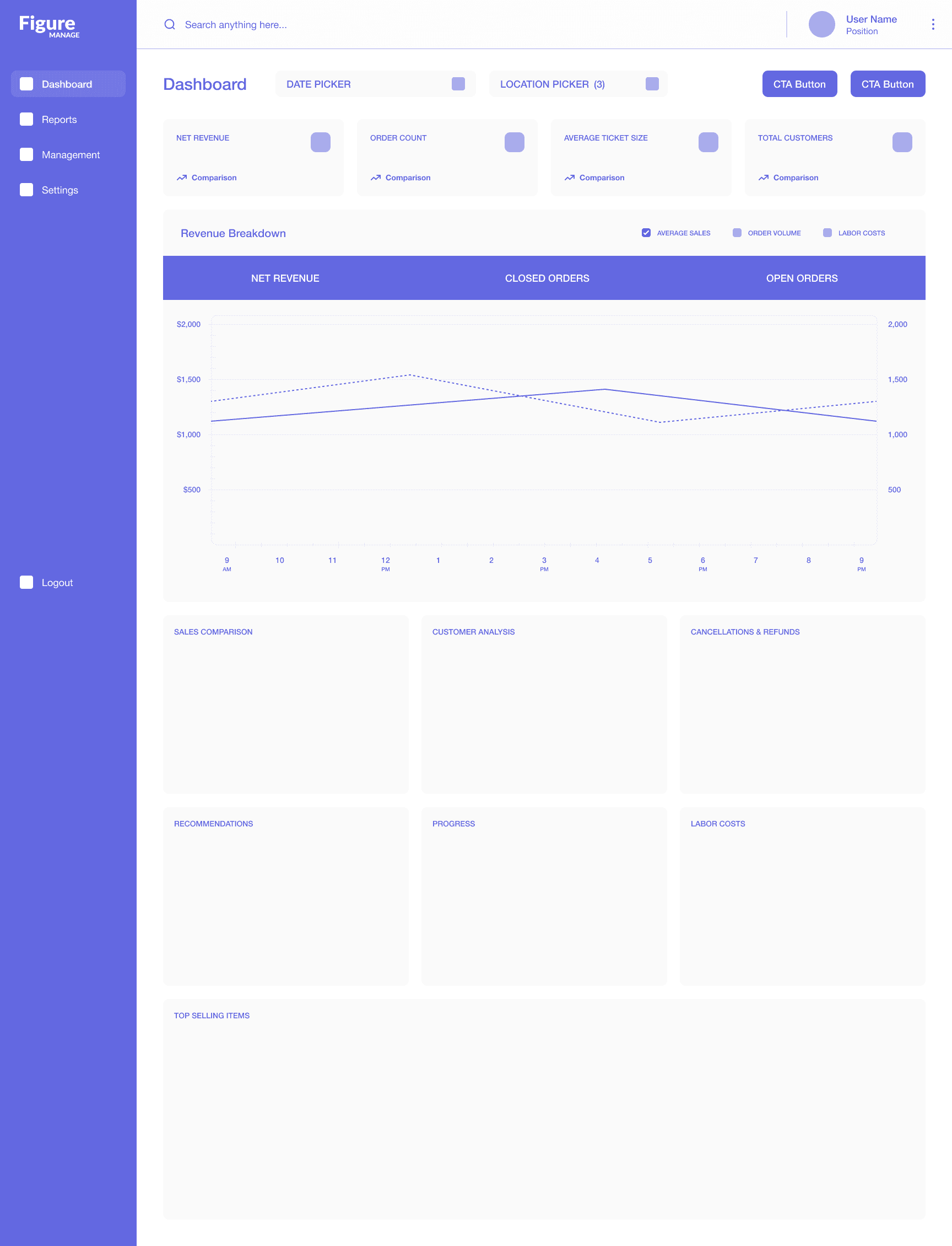
v2 Wireframe
Benefits of utilizing tabs —
1
Reduces cognitive load by limiting distractions and grouping related data into manageable sections
2
Helps users retain focus and prevents mindless scrolling by requiring interaction to access certain sets of information
How might we increase the relevancy of the dashboard for diverse users with different business needs?
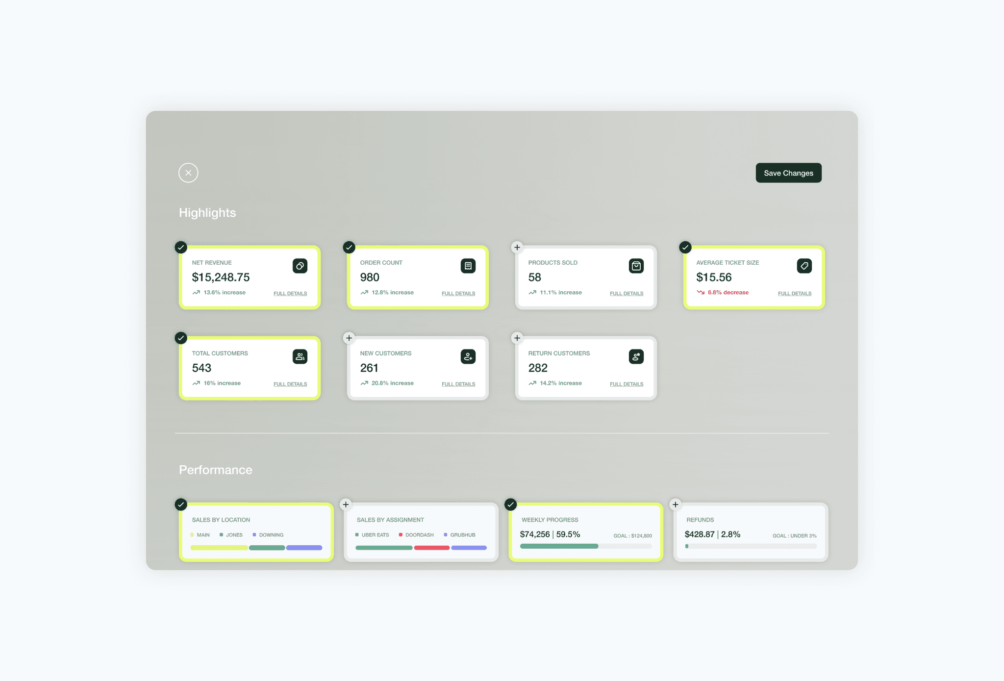
Because the objective of the redesign was to encompass the needs of diverse business owners, I felt that customization would be essential to not only enhance relevance for all users but to eliminate unnecessary clutter, enabling users to focus on the data that mattered most to them. Since this was a feature that was not supported in the previous dashboard, I made sure to include a Call-To-Action button at the top of the screen to encourage engagement.

How might we facilitate user tasks to enable users to focus on the things that matter most?
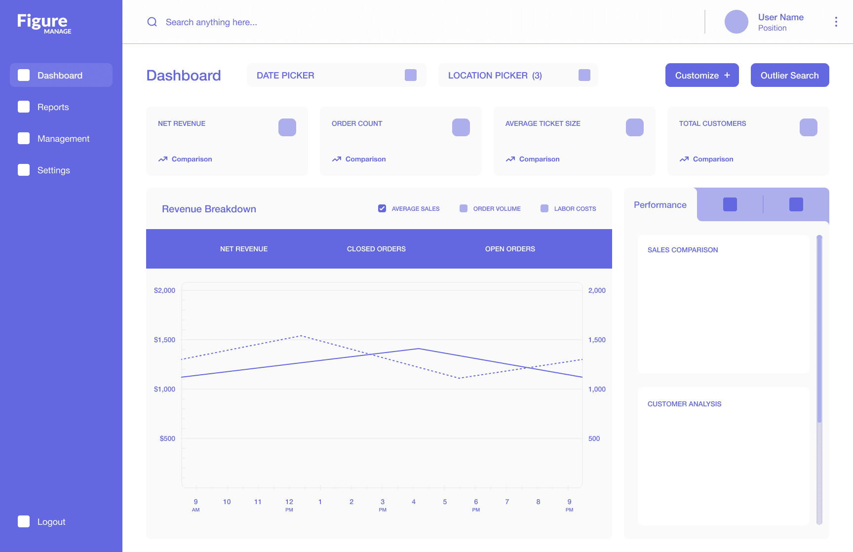
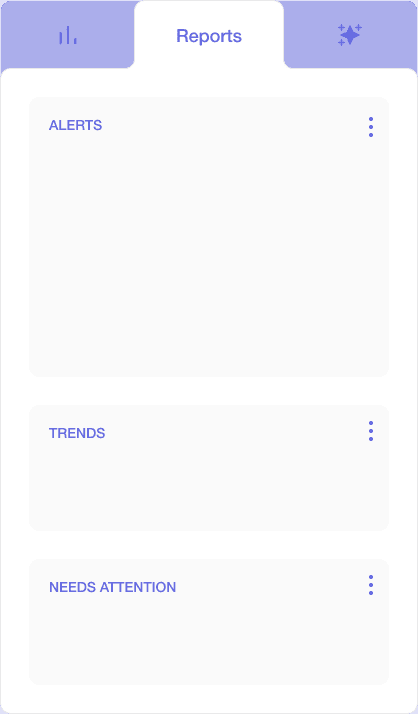
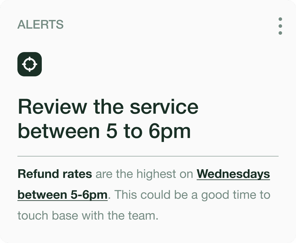
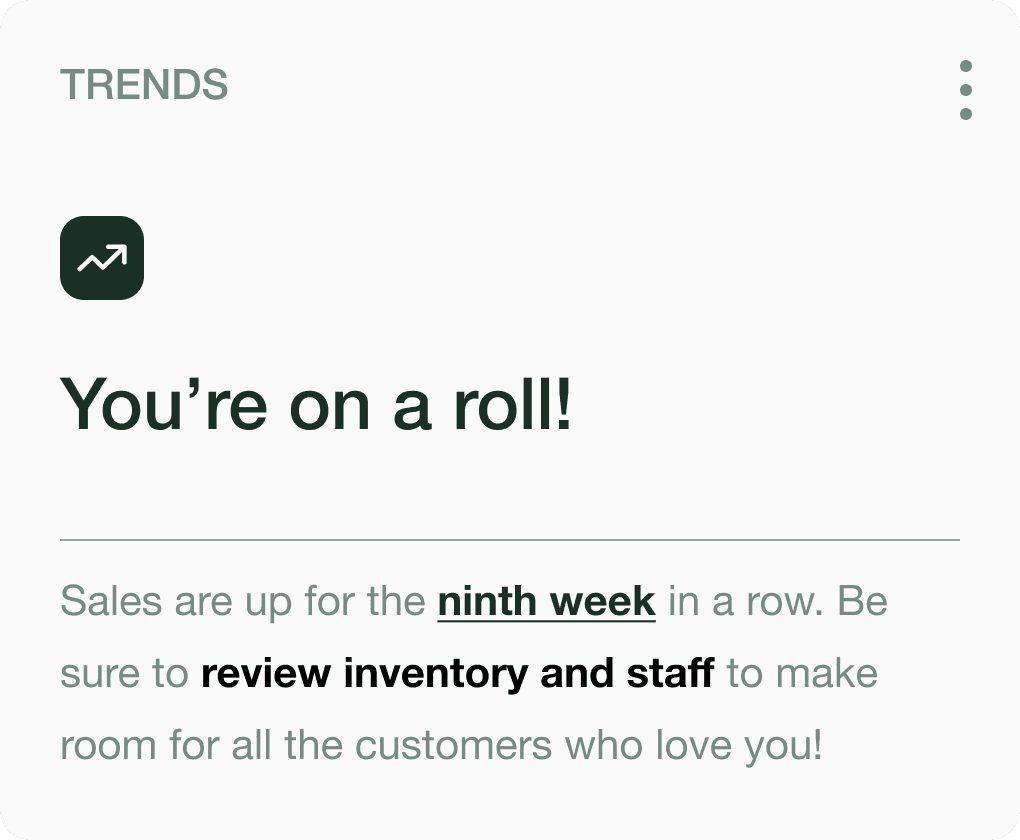
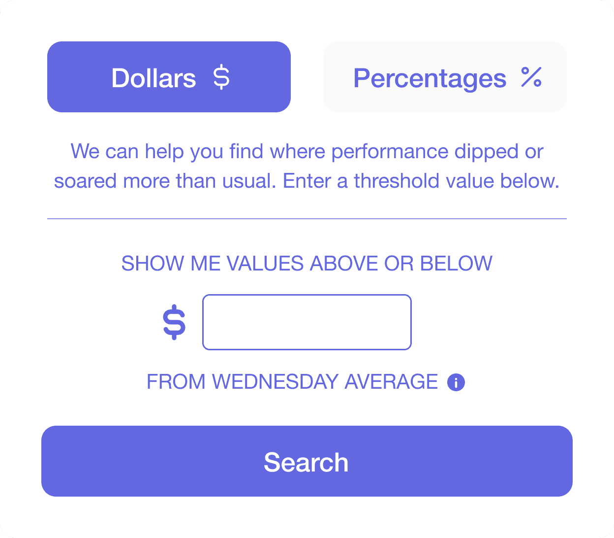
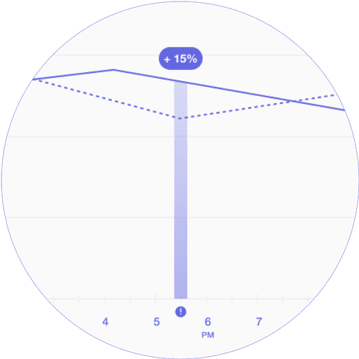
Users had reported that identifying anomalies and outliers was a key user task when reviewing a management dashboard. I considered several options as to how to integrate this user need into the design, ultimately landing on two methods that I felt were the most fit. The first involved creating a 'Reports' section that compiled significant events and anomalies as alerts within the second tab of the dashboard. The second would allow users to be more selective through an 'Outlier Search' in which they could manually input parameters to highlight values outside of the threshold that they have set.
1
2
The 'Outlier Search' facilitates user tasks and allows them to detect patterns that are not evident with metrics alone.
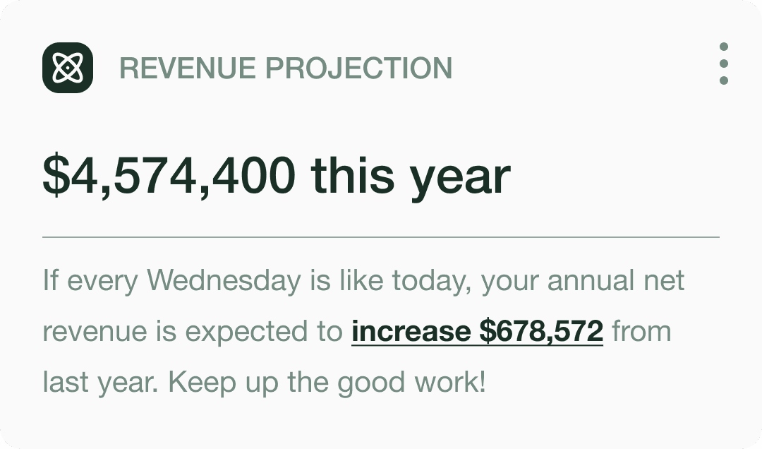
How might we differentiate a way to make insights more actionable?
Based on earlier explorations on "recommendations", I recognized the need for a strong motivator and tailoring to make insights more actionable. To achieve this, I planned to leverage the complex analytics that Figure had on revenue to generate projections that would help users visualize the long-term impact of their decisions. These projections would be positioned in the third tab of the dashboard, creating a seamless flow from observing past and present data to envisioning future outcomes.
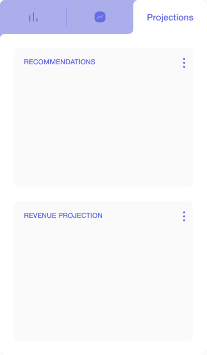
1
Make it evident to users that recommendations are tailored to their unique business to increase value
2
Inspire action by showing users the potential outcome and impact of their decisions
3
Include CTA buttons when applicable to encourage users to take immediate action
DELIVER
01. Snapshot


02. Clickable Prototype
03. Style Guide

VERIFY
Stakeholder Review
A week after the preliminary meeting, I reconvened with the Figure team to review the renewed dashboard. They expressed being impressed with the design and the thoughtful approach behind the new features. We then went over feedback and additional functionalities that they wanted to see implemented, which we decided to pursue at a later stage.
Suggested iterations were —
Displaying cumulative data
I was notified that users had a need for cumulative data in addition to hourly breakdowns. To address this, we explored implementing a draggable, interactive marker on the central line graph. This feature would allow users to see cumulative progress over the specified time period as they move the marker along the graph.
Expanding projections to include analytics outside of revenue
The Figure team shared that during a previous consultation with an analyst, they learned that one of the most significant predictors of an establishment's performance was, surprisingly, the weather. They felt that the ‘Projections’ tab would be an ideal space to highlight insights like this, to not only inform users about their sales progress but also provide expectations about their performance based on external factors and events.
REFLECT
This project with Figure has been an invaluable opportunity to experience firsthand what it’s like to design for an already established product. Engaging with diverse perspectives and advocating for the needs of real users brought a thrilling sense of reach and impact – especially for users who, like my parents, were local business owners.
Looking back, there are a few things I wish I had done differently, such as asking users more in-depth questions about the ‘why’s’ behind their actions and exploring more ways to enhance visibility. Balancing various expectations and constraints also proved to be challenging at times, which added a layer of pressure to the process. However, I feel that I was able to come out of this journey stronger with an improved ability to streamline my design process and communicate effectively with stakeholders.
Although development for this project was pushed to next year due to capacity, it allowed me to secure a 4-month retainer with Figure.
NEXT STEPS
The next steps that I would take to build upon this project are —
Implementing the proposed iterations and conducting user tests to validate hypotheses and gather feedback
Incorporating features that improve ease of use, such as allowing users to expand tabs or reorder widgets for better visibility
Building a preliminary dashboard for account holders with multiple businesses to help them review the collective breakdown of performance across all locations
Exploring AI to handle the 'Reports' or 'Projection' tabs to enable users to extract any desired information.